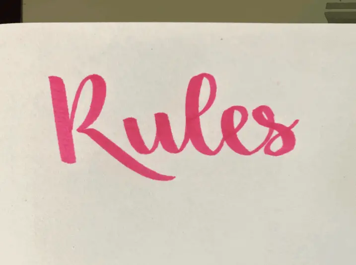
What Are the Rules of Modern Calligraphy
When starting out a lot of different hobbies there are going to be some certain rules that you are going to need to follow. Well, when learning modern calligraphy and hand lettering there is a lot of things you are going to need to learn.
One of the most important things is learning the basic rules so that you are able to start off on the right foot. In this article, I am going to be going over the main rules that you should be going over when barely starting out this new hobby.
Here is the quick and short answer to your question and I will be going more in-depth on this throughout the rest of this post.
The rules of modern calligraphy are:
- Consistency
- Upstrokes are thin, Downstrokes are thick
- Basic strokes of calligraphy
- Creating guidelines correctly
- Using the correct tools
- Using those tools the correct way
Those were just some of the main rules that you must know when wanting to learn this art form.
This is a summary of what I am going to talk about today:
- Why It Is Important To Follow Rules of Calligraphy
- One of The Most Important Calligraphy Rules
- Upstrokes Are Thin, Downstrokes Are Thick
- Importance of Guidelines
- Importance of Consistency
- Using The Correct Tools
- Using Your Calligraphy Supplies In The Correct Way
- Final Thoughts
Why It Is Important To Follow Rules of Calligraphy
So why is it important to follow these basic calligraphy rules that I am going to be talking about today?
Well without these rules you are not doing calligraphy the correct way, and usually, you can tell when a calligrapher is or is not using these basic rules.
Essentially perfect practice makes perfect. This just means you have to start on the right foot. If you are starting out calligraphy without following the rules you are building up bad habits, meaning you are not practicing in the best way possible.
If you are following these rules you are building up good habits and practicing in the most perfect way possible. I am not saying that your calligraphy should be perfect, but that your calligraphy (at first) should be following some basic rules.
For example, a lot of calligraphers make the mistake of not learning the basic strokes. These basic strokes are so important because they help you form your letters. If you start forming your words this is going to lead for you not to be doing calligraphy in the correct way.
So if you are practicing the incorrect way you are not going to get anywhere. If you are practicing the correct way you are going to improve.
The basic rules of calligraphy are just a set of guidelines that beginner calligraphers use when they are barely learning the art form, to help guide them through the process.
Without learning these basic rules it can actually hurt you in the long run. If you been doing something wrong for a long time it is going to take an even longer time to stop doing it. Same thing with this hobby.
If you have not been learning the basic strokes it is going to be harder for you in the long run. That is just one example, but all of these rules can come into play.
One Of The Most Important Rules of Calligraphy
This is one of the most important things that you are going to need to know to be able to start learning hand lettering and modern calligraphy the right way.
This is going to be one o the biggest pieces of advice, in my opinion, that I can give you.
One of the most important rules of calligraphy is learning the basic strokes when starting out. Before you even start drawing out your words or even letters learn the basic strokes of calligraphy.
The basic strokes of calligraphy will help prepare you for creating our different letters and connecting them together.
WHY ARE THE BASIC STROKES IMPORTANT
So why are these basic strokes important to learning calligraphy?
Well, one of the main reasons is that the basic strokes help you form your letters. So you can put basic strokes together to form almost any lowercase later in the Latin alphabet.
These strokes can also be used to connect letters together.
A lot of people make the mistake of not using these basic strokes and just doing calligraphy like it is cursive, with just line variation.
This is totally wrong cursive is not calligraphy. Cursive has it’s own form of writing while calligraphy has its own format of creating letters.
If you are a bit confused or want to learn more you can check out my article explaining it a little bit more here.
A lot of times you can actually tell when someone is using the format of cursive for calligraphy, and if they are using the basic strokes for their lettering.
WHAT ARE TEH BASIC STROKES
There are 8 basic strokes of calligraphy:
- Upstroke
- Downstroke
- Underturn
- Overturn
- Compound Curve
- Oval
- Ascending Loop
- Descending Loop
Here is a picture that shows you how each of these looks like.

Now let me give you a couple of examples to show you how we can use these to create our letters.

Upstrokes Are Thin, Downstrokes Are Thick
Another really important rule throughout all different types of modern calligraphy is to make sure that all of your upstrokes are thin and downstrokes are thick, especially when talking about faux calligraphy.
This just means that when every time you move your utensil up it is going to be a thin stroke, whenever you move your pen down it is going to be a thick stroke.
Especially in faux calligraphy, you have to be able to identify where the upstrokes and down strokes are to be able to add line variation to your words.
If you are a bit confused about what faux calligraphy is you can check out my full tutorial all about it here.
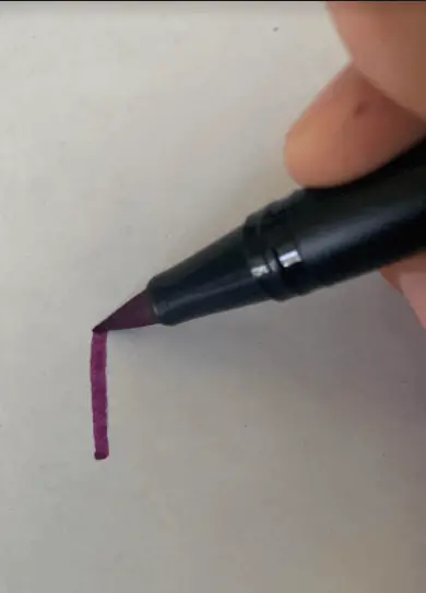
Also a lot of line variation you get through the type of utensil you are using, depends on the amount of pressure that you are going to put on it. This means the more pressure that you put on your brush pen or dip pen the thicker the stroke is going to be.
So whenever you are doing an upstroke you are going to put less pressure, whenever you are doing a downstroke you are going to apply more pressure. This is what leads to your line variation.

Importance of Guidelines
Another important part of calligraphy is learning to create the correct guidelines for your hand lettering.
Having guidelines, in general, helps you plan out your lettering illustrations and helps you practice. Without the correct guidelines, it is going to make it hard for you to practice, and you won’t be practicing correctly.
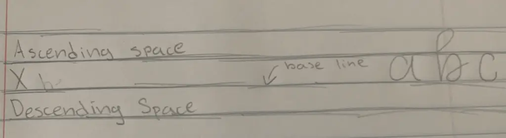
Learning calligraphy guidelines includes also how you layout your calligraphy in the correct way. These guidelines are made up of different parts.
For example, we have the baseline ( which is what all of the letters sit on). Then we have the ascending space and descending space. There is so much more that comes into these guidelines and it is important that you learn them.
WHAT ARE THESE GUIDELINES
Now let us move on from the importance of using these guidelines.
Guidelines are made up of many different parts. Here is a quick run-through:
- X-height
- Ascending Space
- Descending Space
- Baseline
- Slanted Lines
Slanted lines are optional since not all calligraphers like their calligraphy to be at an angle.
Now here is a picture of these guidelines.
Importance of Consistency
The next rule is keeping your calligraphy consistent. Conctency is something that is built up over time/experience and practice.
Consistency just means that you keep your letters throughout the whole entire lettering illustration looking the same. For example, all of your lowercase As should look the same, all of your letter Cs should look the same, so on and so forth.
How these letters look totally depends on your own lettering style, and if you are doing the traditional side of calligraphy it depends on the script/type.
Consistency can include a variety of different things:
- Your own personal style
- Where you add your flourishes/embellishments
- Angle of your letters
- Size of your letters
- Where is the baseline of your calligraphy (I am referring to calligraphy guidelines)
- And so much more
Using The Correct Tools
In my opinion, there are no incorrect or correct tools that you can use for calligraphy. You can literally do calligraphy with a pencil or even a regular pen, but let us look at a few things.
When starting out you might feel that you must have to get those expensive tools to be able to do this hobby.
A lot of beginners I find go out and buy these expensive fountain pens, and later on, find out that you can’t exactly use it for calligraphy. Or maybe you just got the wrong dip pen nib which is supposed to be used for other things.
Don’t worry I have made that mistake before.
TH main thing you should get from this is that you don’t need expensive tools. You can just do calligraphy with a pencil or even a crayola maker.
Another big question is about paper. So you need special paper for calligraphy, actually, you don’t. It all depends on the type of modern calligraphy you are wanting to learn. If you are looking for paper recommendations you can check out my full article about it here.
Paper might not be that important for pointed pen calligraphy, but it is a very big aspect for brush pen lettering and watercolor lettering.
Without having the correct paper for brush lettering you can actually lead for your brush pens to fray. Check out my article about why your brush pens are fraying and how you can stop pit from happening again.
Looking for paper recommendations (specifically for brush lettering) check out this full guide here.
Using These Tools Correctly
When starting out it is also important to learn how to use all of these different tools correctly. Like how to take care of your calligraphy nibs, how to use your brush pen correctly.
So one of the biggest rules with a lot of calligraphy writing utensils is holding your pen always at a 45-degree angle to your paper.

But there are differences between all different tools. For a brush pen you would hold it out to the side (like a pencil) but at a 45-degree angle.
While with a dip pen you are holding it torwards you, not away from you. You should also learn how to take of your pens correctly.
Here are a couple of articles that I have done on calligraphy dip pens:
Now if you are more torwards hand lettering and brush lettering I have actually done a full guide so that you can learn how to use these brush pens.
Final Thoughts
Those were all of the basic rules that you should know when starting out hand lettering or any type of calligraphy. Hopefully, throughout the article, I didn’t sound too repetitive.
If you have any more questions, feedback or concerns feel free to comment.