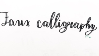
Beginners Guide To Doing Faux Calligraphy: What Is Faux Calligraphy?

Hi everyone in this lettering/calligraphy tutorial I am going to be talking about faux calligraphy. I am first going to answer an important question that you might be wondering.
What is Faux Calligraphy?
Faux Calligraphy (also considered fake calligraphy) is a way to be able to get the effect of calligraphy without a brush pen or calligraphy pen. This is a great way to do calligraphy on a budget.
Right now I am going to be showing you everything that you are going to need to know when starting out doing faux calligraphy. Here is just a brief summary of what I am going to be showing you today:
- Materials for Faux Calligraphy
- Outline
- Step By Step Tutorial
- Basic Strokes
- Putting All of your Letters Together
Materials For Faux Calligraphy
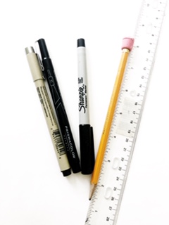
Here I am just going to be going over the different types of materials that you are going to need when doing faux calligraphy.
PAPER
Since we are not going to be using brush pens for this tutorial you could any type of paper for faux calligraphy.
If you were wondering for this tutorial I am using XL Media Paper.
PENCIL
Again you could use any pencil. We are going to be using the pencil to be able to create our outlines for our lettering illustrations.
ERASER
Don’t worry all of us make mistakes.
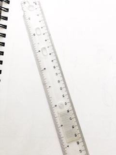
RULER
This will also help us out when it comes to drawing our outlines for our faux calligraphy.
Pen
I would prefer a fine liner. I would be using my micron pen for this tutorial but again anything is fine.
Creating Our Outlines
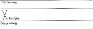
Outlines/ guidelines are always helpful and I recommend if you are a beginner to use them because they will help you out with keeping your letters consistent and balanced.
I first like to draw out my x-height with my ruler.
After that, I create an ascender space and then a descender space.
If you want your letters to be at an angle you can create slant lines also. Like this:
Step By Step Tutorial:
STEP 1:
You are going to want to first go to write out your word with the basic strokes that I explain in the next section.
STEP 2:

Where you have all of your downstrokes you are going to add a second line like this to the inside of your letters.
Step 3:
Then you are going to fill the space in.
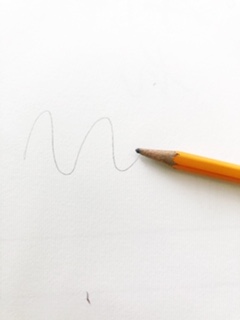
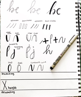
Basic Strokes
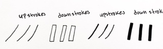
The number one rule in calligraphy is upstrokes are thin down strokes are thick.
Now I am just going to say something. If you think you are just going to be writing in cursive and then add line weight you are wrong.
If you want to learn the difference between cursive and calligraphy here is a link to my article.
Ok, so where are you even going to add your thick strokes. Well in all of your downstrokes.
The best way to be able to practice this is by practicing the basic strokes of calligraphy.
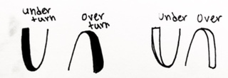
The 8 basic strokes of calligraphy are:
- Upstroke
- Downstroke
- Underturn
- Overturn
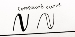
- Compound Curve
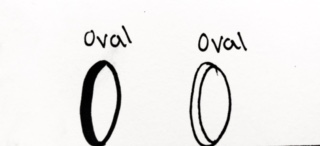
- Oval
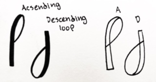
- Ascending Loop
- Descending Loop
Let me show you all of the different strokes.
With your guidelines, I would recommend to keep on practicing. The key thing is you want everything to look consistent witch your guidelines are going to help you with.
Once you have mastered these basic strokes I would recommend starting creating your letters. Remember to stay consistent.
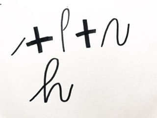
How you are going to do this is by connecting the basic strokes to form letters. Let me show you want I mean. Here are a few examples below.
Putting All of Your Letters Together
You would expect that you are going to have to draw each letter one by one but that is not the case.
You are going to first make sure you have all of your guidelines in place and with your pencil just start writing out your letter ( don’t do cursive, keep the basic strokes in mind).
Once you are done with that you are going to sketch out your downstrokes.
After that simply shade the space in and you get this awesome calligraphy look.
Of course, once you have mastered all of your basic rules you can start breaking them and developing your own style.
Just remember you should always first learn the rules fully and master them before you re going to be able to break them.
Here are just some designs that I have been able to do with faux calligraphy.
Conclusion
You have just learned everything that you need to be able to do faux calligraphy. Remember that perfect practice makes perfect.
If you are not practicing the way you are supposed to practice then you will never master it. This includes mastering the basic strokes.
My big tip is to master the basic strokes and you’ll be creating awesome lettering illustrations in no time.
If you have an questions feel free to comment.